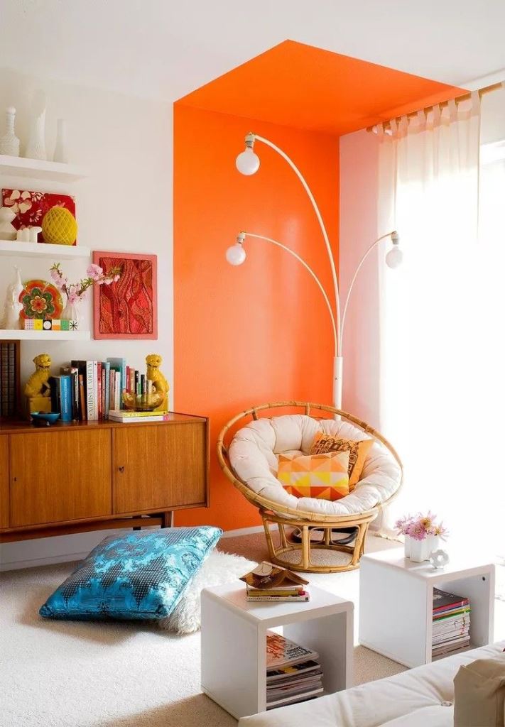
Dividing zones in an open layout can be done in various ways: with shelves or other furniture items, screens, plants, decor and so on but the most practical idea is using color. Why color? Because whether you have a small or a large layout, not a single inch of livable space will be lost. Besides, color and shapes also matter as they make your room more personalized. Forget classic accent walls and let’s dive into the whole ton of fresh ways to separate the zones with colors.
Monochromatic Zones
One of the best up-to-date solutions in zoning is keeping one space monochromatic. First of all, monochrome is trendy, second, such spaces look bigger as one color creates an illusion of continuous space and third, such division is the boldest. Usually such a solution is applied to kitchens, staircases and entryways. Prefer lighter colors if you want your zone to look larger, go bold if you want it to stand out. If you miss sunlight, stick to sunny yellows that will imitate it.
Have an arched doorway? Accent it like here: with bright edging that goes to the floor. The arched niche repeats the shape.
The entrance is done in peachy pink, and the top is arched, so you add both color and a trendy touch to the space.
The staircase is painted bright yellow, just like the walls around it, which makes it a separate space.
The drop zone is done in a light green shade that not only separates it from the rest of the space but also refreshes it.
The niche at the entrance is done with a soft terracotta shade, which separates it from the dining room.
The entrance is done in a lovely green shade, which also creates an illusion on the ceiling making it look sloped.
The kitchen zone is color blocked monochromatic in a beautiful blue shade, and a large mirror reflects the light making it look bigger.
The entrance is done in blush, with cabinets and a door, and it separates it from the rest of the layout.
The niche with a working space is highlighted with mustard paint, which makes it visually separated.
The dining corner with an arched doorway is done in the single burnt orange shade that separates it from the rest of the layout.
The sleeping nook at the window is accented with yellow to make it contrasting with the greys around.
The bright blue kitchen with gold accents stands out from the white space.
The entryway is done dark green that feels and looks outdoorsy, which is extending outdoors to indoors.
The kitchen zone is done in cobalt blue completely, and the color usage also highlights the sloped ceiling.
Both the kitchen and the dining space are done bright yellow to separate them from the living room zone.
The kitchen cube is done in a lovely shade of blue, which makes it a separate space. (via apartmenttherapy).
This built-in lounging zone is done in a bold yellow shade to make it stand out in the neutral room. (via casavogue).
The entryway is highlighted with bright orange, which accents the curved doorway. (via admagazine).
The drop zone is done in sunny yellow, which makes it look bigger and light-filled.
The kitchen is done in bold orange shades, which make it stand out a lot from the black and white space.
Bright Accent
Accent your zone making a bright stripe behind it on the wall, not the whole wall but its part only. Extend this stripe to the ceiling and even floor for a bolder look. This accent will show off your space, especially if you choose a contrasting color. Such a concept allows you to separate zones without making them look smaller and keeping the airy feel in the space. This idea is often applied to reading nooks, dining and breakfast spaces.
The dining zone is highlighted with a burnt orange accent that is continued to the ceiling with molding and a lamp.
This lovely dining space is done with a burnt orange accent that goes up to the ceiling with a pendant plant.
Here's how to visually separate the zones in a creative way: there's an accent over the kitchen that echoes with the fireplace color.
An accent wall doesn't always mean a whole wall, and this is an example of how you can add not only color but also shape.
The grey space features a super bold dining zone done in a vibrant mustard shade but with grey chairs.
An old good accent wall is always a cool solution, and if you continue the color to the ceiling, it will look more modern. (via dwell).
Creatively Shaped Accents
Want a dopamine-infusing space? Make the colorful accent in some creative shape: arched, curved, or geometric. Such an accent can be also extended up and down depeneding on its shape, and it’s a more modern version of the previous point, which will also keep your room lighter and airier but also fun, cute and sweet. This idea can be applied to dining and breakfast zones, workspaces and any other spots.
The sunlit dining space is accented with yellow paint, which covers the doorway and creates a geo accent on the wall. (via uk).
The dining zone is accented with mustard paint, which is applied using scallop stencils for a cuter look.
I love the idea of accenting a corner with irregularly shaped accents of bold colors, it looks very dopamine-infusing.


